Pick a theme
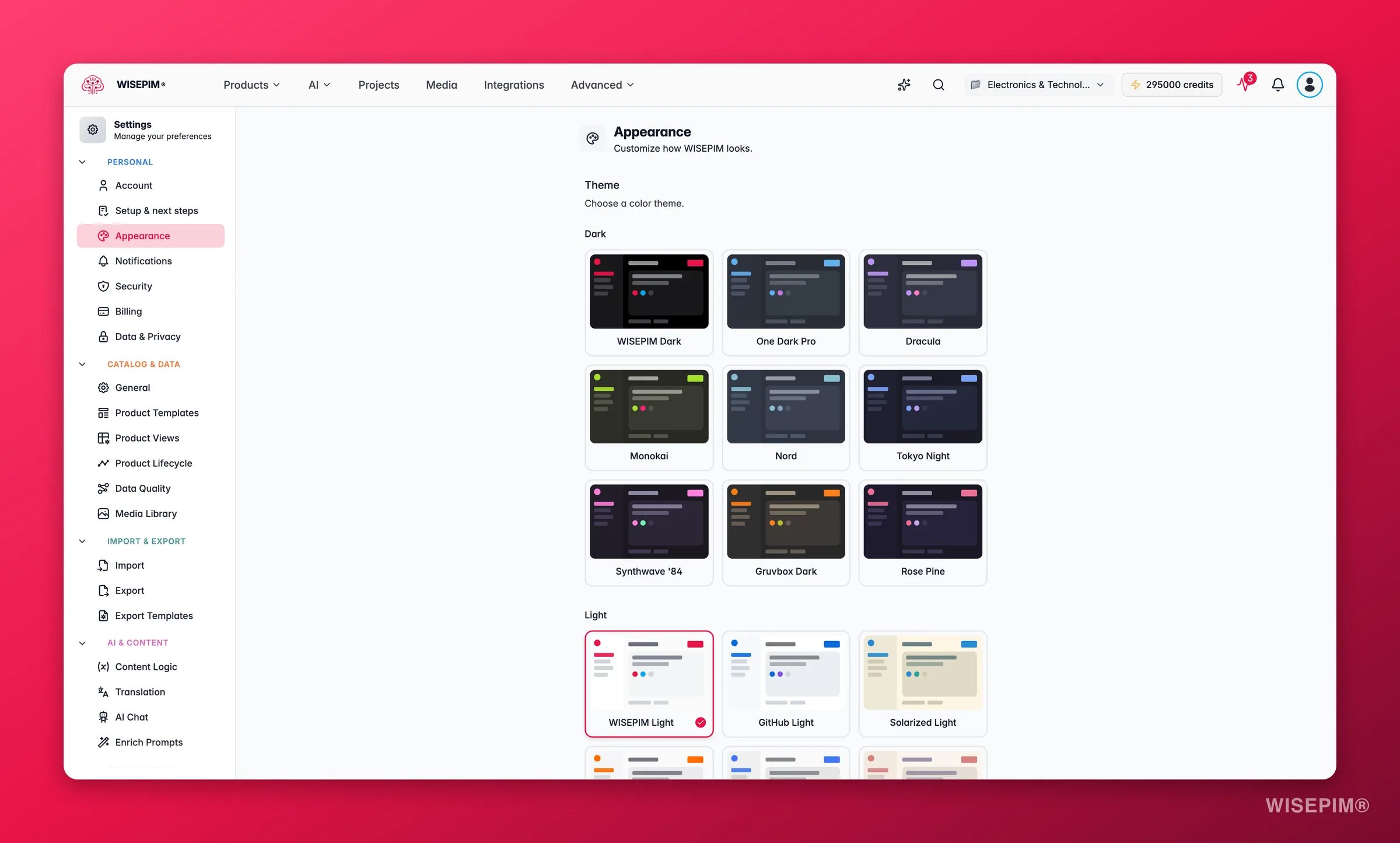
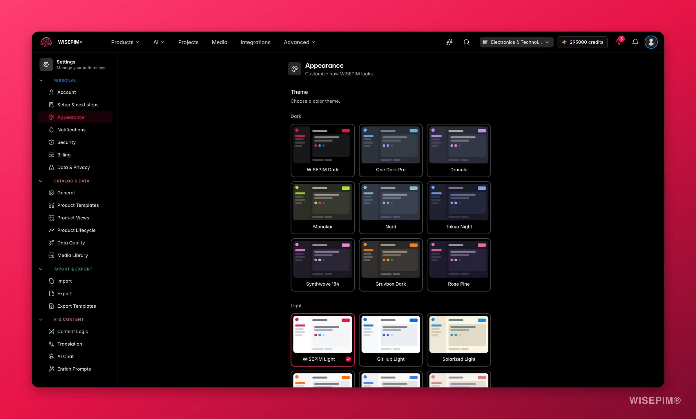
Dark themes
| Theme | Description |
|---|---|
| WISEPIM Dark | The default dark theme with WISEPIM brand colors |
| One Dark Pro | Inspired by the popular Atom editor theme |
| Dracula | Purple-accented dark theme |
| Monokai | Classic code editor color scheme |
| Nord | Cool, arctic-blue palette |
| Tokyo Night | Calm, blue-tinted dark theme |
| Synthwave ‘84 | Vibrant retro neon colors |
| Gruvbox Dark | Warm, earthy dark tones |
| Rose Pine | Soft, muted dark theme with rose accents |
Light themes
| Theme | Description |
|---|---|
| WISEPIM Light | The default light theme with WISEPIM brand colors |
| GitHub Light | Clean, GitHub-inspired light theme |
| Solarized Light | The classic Solarized palette in light mode |
| Dutch Orange | Light theme with warm orange and blue accents |
| Atom One Light | Light counterpart to the One Dark Pro theme |
| Rose Pine Dawn | Soft, warm light theme with rose accents |
Set the font size
Use the dropdown next to the Font size label to switch sizes:| Size | Pixels |
|---|---|
| Small | 14px |
| Medium | 16px |
| Large (default) | 18px |
Tune interface effects
| Setting | What it does |
|---|---|
| Translucent UI | Adds a frosted-glass look to elements like the sidebar and dialogs |
| Pointer Cursor | Shows a pointer cursor over clickable elements. Turn it off for the default cursor |
Appearance preferences save locally and apply right away. They stay set across sessions in the same browser.
Related
Account
Update the name and email tied to your WISEPIM login.
Language
Set the interface language for your account.
Command Menu
Jump to any page or action with one keyboard shortcut.
Settings overview
Browse every personal and project setting in one place.