
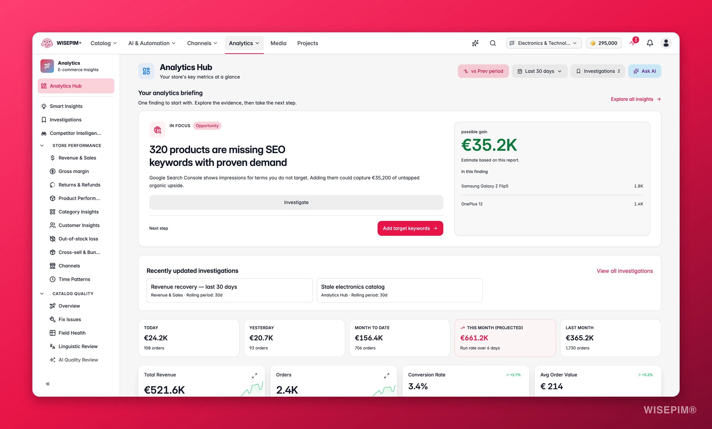
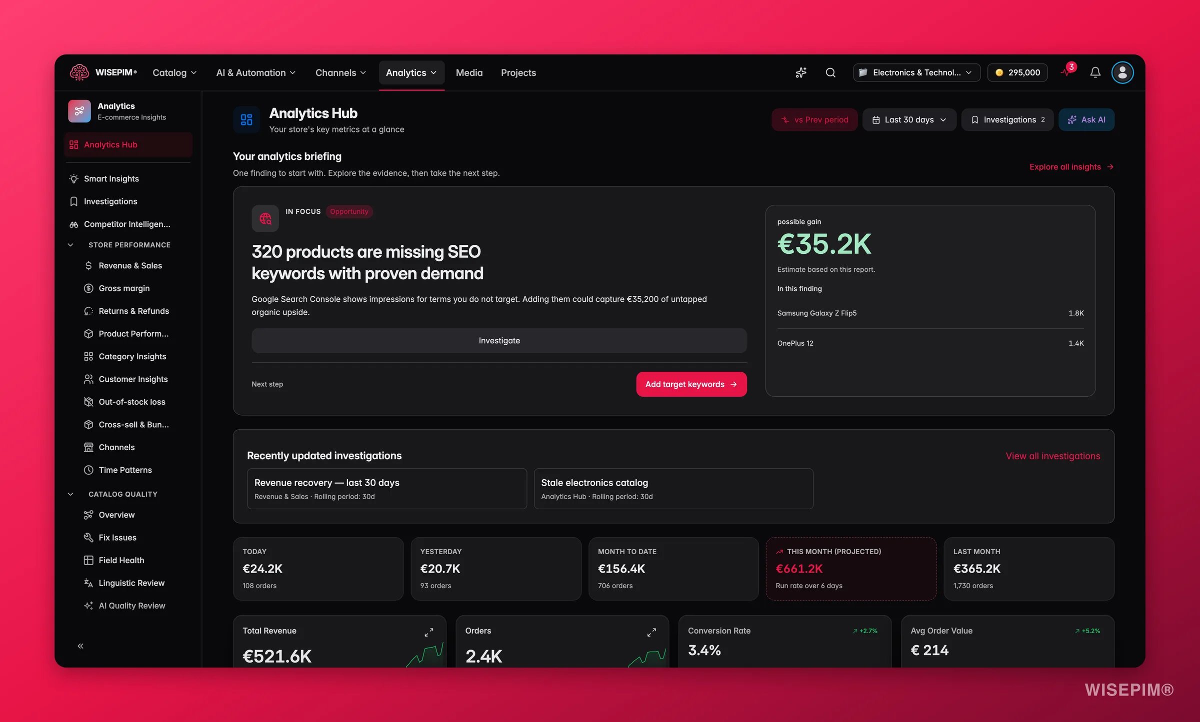
Analytics data comes from your connected e-commerce platforms. Make sure you have at least one integration set up to see real data. Want to explore first? Try the interactive analytics sandbox with demo data. No setup required.
Key metrics
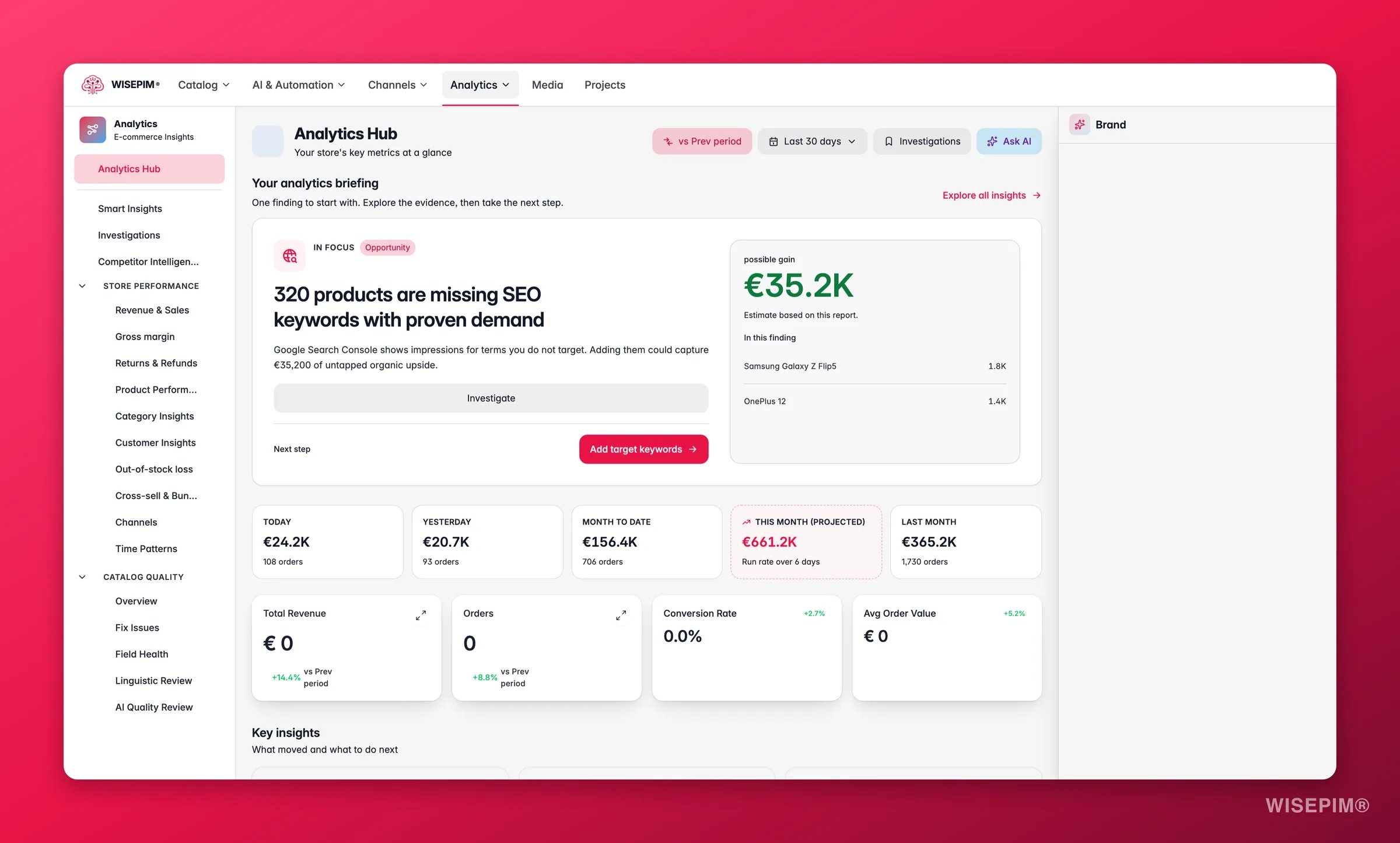
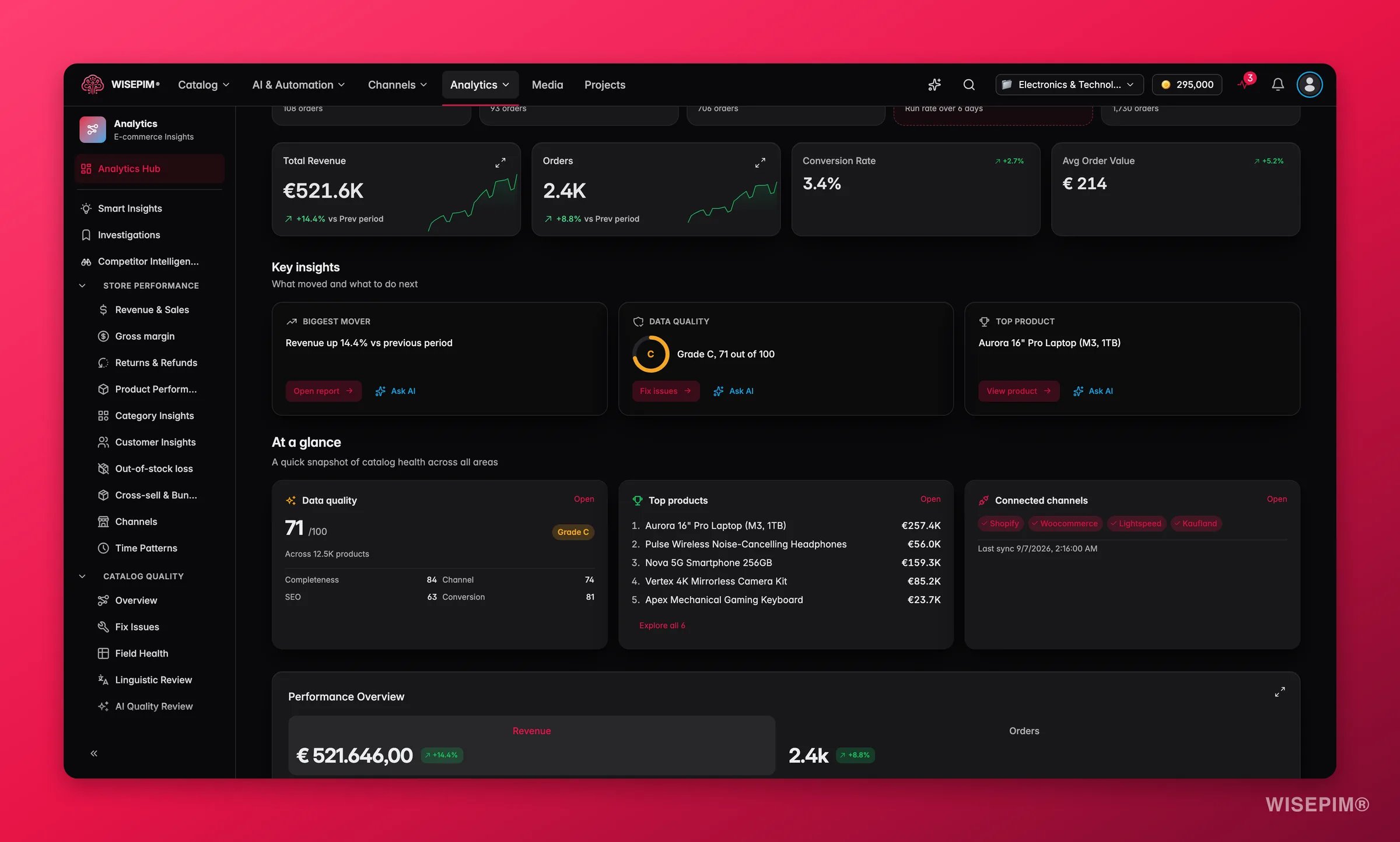
Four hero metric cards sit at the top of the Hub:- Total Revenue: overall revenue with a trend sparkline and period-over-period change.
- Orders: total order count with visual trend data.
- Conversion Rate: the share of sessions that result in a purchase.
- Avg Order Value (AOV): revenue divided by order count.
What healthy numbers look like
These are directional benchmarks for general e-commerce. Your own baseline is what matters most, use these to sense-check, not to grade yourself.Reading the comparison arrows
- A green arrow means the metric improved versus the previous period.
- A red arrow means it declined.
- Two metrics moving in opposite directions is often the most useful signal. Orders rising while revenue falls signals a drop in AOV. Conversion rising while revenue falls signals fewer sessions overall, a traffic problem, not a content problem.
Revenue by period
A Revenue by period strip of five tiles gives you the calendar view the date-range selector does not: Today, Yesterday, Month to date, This month (projected) and Last month. Each tile shows revenue with its order count, and the strip notes Order data up to so you know how fresh the numbers are. Click a tile to open the Revenue & Sales report for exactly that range. This month (projected) is a linear run rate: this month’s revenue per finished day, stretched over the whole month. It only appears once a minimum number of days have finished; before that the tile reads Needs N finished days. Hover it to see the daily rate and the days it is based on.The projection assumes the rest of the month looks like the days so far. A promotion or a quiet week early in the month skews it, so read it next to Last month rather than as a forecast.
Key insights
Below the hero cards, up to three insight chips surface the most important signals from across your store without requiring you to dig into individual reports:- Biggest KPI mover: the metric that shifted the most versus the previous period, with a one-click link to the relevant report.
- Data-quality grade: your current overall score at a glance, so you know whether enrichment work is keeping pace.
- Top revenue product: the single product earning the most in the period.
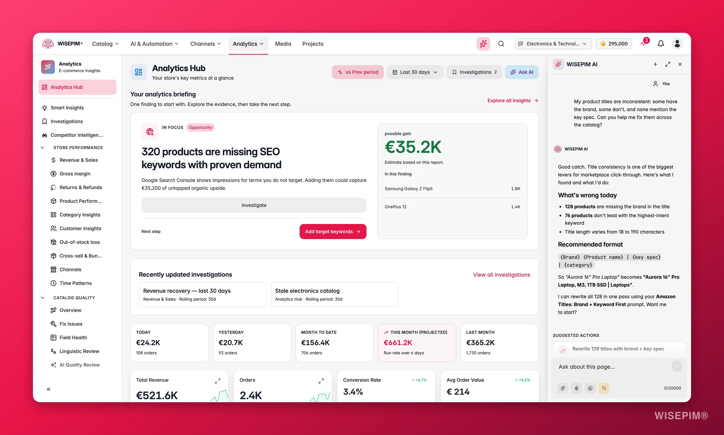
Ask AI about your numbers
Performance charts
The charts section shows revenue and orders as separate views: a revenue trend line and an orders trend line, so you can read each independently and spot divergences. Hover any data point for the exact daily value. Interpreting the patterns: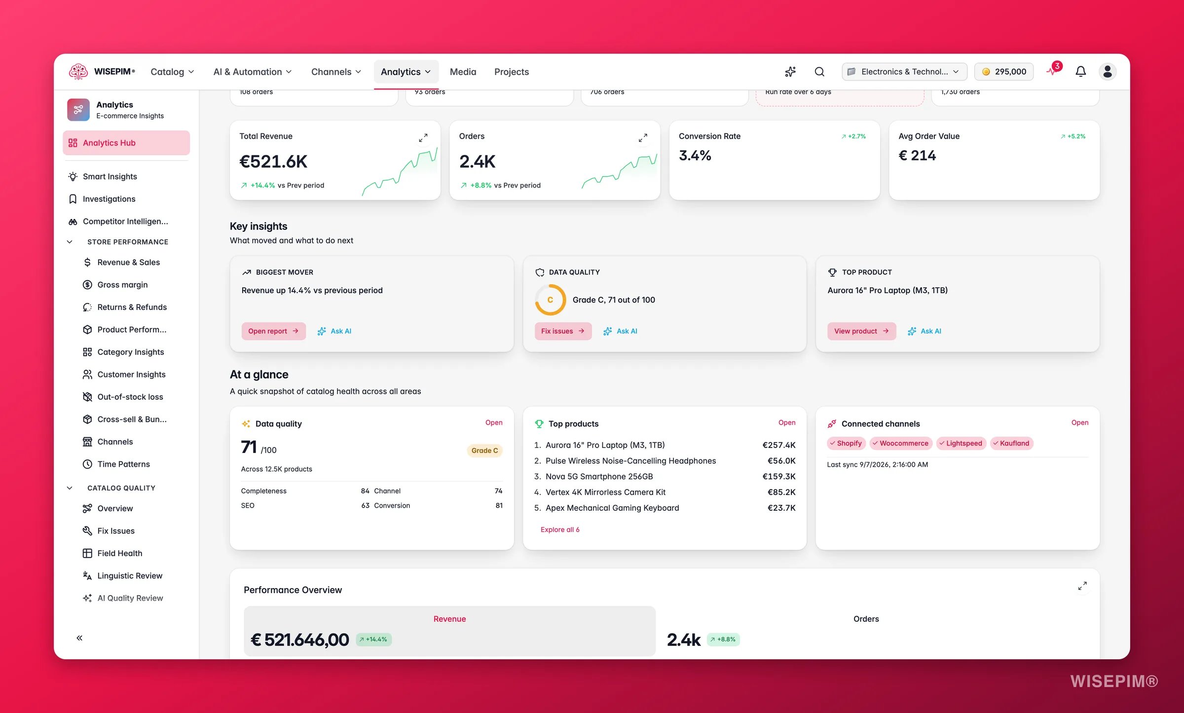
Expanded charts
Most charts across the analytics reports have an Expand chart button. The expanded view adds a few tools that work the same everywhere:At a glance
The snapshot panels give you a quick read on store health without opening a separate report:- Data-quality score: your overall grade plus the four domain breakdowns, Completeness, Channel Readiness, SEO, and Conversion Potential. Hover any domain bar to see which product families are dragging it down.
- Top 5 products by revenue: the five highest-earning products in the selected period with revenue and trend arrow, directly linked to the Product Performance report.
- Connected channels: each active channel with its last-sync time, so you can spot a stalled integration at a glance.
Data freshness
The Data freshness panel tells you exactly how current your analytics are. It shows:- Last-sync time per connected platform, so you can see whether data is minutes or hours old.
- Order count included in the current data set for the selected period.
- Per-platform sync status: green means the last sync completed cleanly; amber or red flags an error you should investigate in Integrations.
Fetching fresh data triggers a sync for all connected platforms. It typically takes 30–90 seconds depending on order volume.
Recent activity and improvement impact
Scroll down the Hub to see two more panels side by side: a Recent activity feed listing the latest product changes, enrichments, and automation runs; and an Improvement impact ranking showing which enrichment or fix actions produced the biggest measurable revenue lift.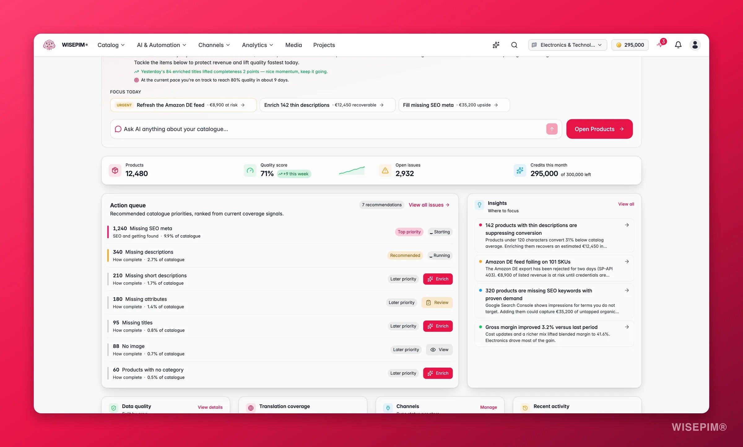
Smart Insights
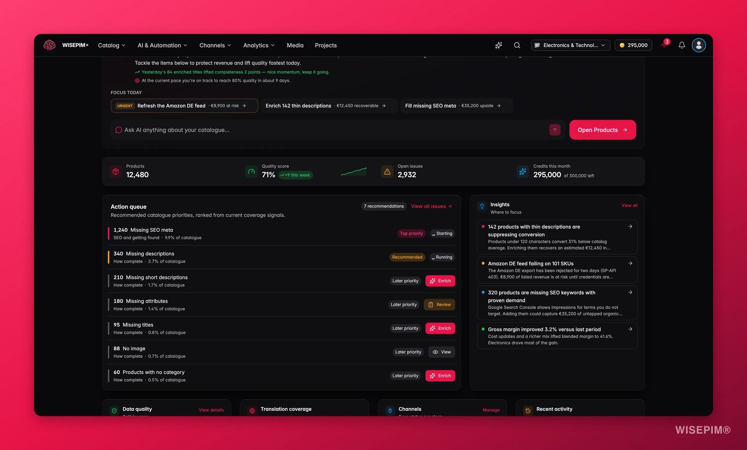
The Smart Insights section (also reachable from the sidebar under Insights) generates plain-language signals ranked by impact across revenue, margin, returns, and data quality. Insights are organized into two groups:- Protect revenue: issues that put current revenue at risk (stockouts, high return rates, quality drops).
- Capture upside: opportunities to grow (enrichment-driven lifts, cross-sell potential, SEO gaps).
Enrichment Impact
The Enrichment Impact report (under Revenue Intelligence in the sidebar) maps revenue lift to specific AI enrichment actions, per SKU. It answers the question: “Is our enrichment work actually moving revenue?” You can see total revenue gained, revenue per enrichment credit spent, and which enrichment actions (image recognition, description generation, etc.) earned the most. Products where revenue declined after enrichment are flagged for QA.Returns & Refunds
The Returns & Refunds report shows your return rate, refunded revenue, and a correlation chart between data quality grade and return rate. Products with accurate descriptions, proper images, and complete specs set correct buyer expectations. They tend to come back less often.Act on what you find
Revenue is down versus the previous period
Revenue is down versus the previous period
Check whether orders also fell (traffic or demand problem) or held flat (AOV problem). If AOV dropped, open Revenue & Sales to see which categories or products shifted. If orders fell, check the Data freshness panel for a stalled integration before drawing conclusions.
Conversion rate dropped
Conversion rate dropped
A conversion drop without a traffic drop points to the product listing itself, content, images, price, or channel readiness. Open Data Quality and filter to the affected products. Adding missing images and generating meta descriptions are typically the fastest wins. Outcome: recovering even 0.5 pp of conversion on meaningful traffic volume translates directly to revenue without any ad spend.
Data quality score is amber or red
Data quality score is amber or red
Use the quality score panel on the Hub to identify which domain is dragging the score down, then go straight to Data Quality, Fix Issues for a ranked list of the highest-impact fixes. Outcome: higher quality scores correlate with lower return rates and better channel listing acceptance.
A connected channel shows amber or red sync status
A connected channel shows amber or red sync status
Open Integrations and inspect the failing platform. A stale sync means your analytics data is incomplete, metrics for that channel will be understated until the sync recovers.
The top insight chip shows a data quality grade drop
The top insight chip shows a data quality grade drop
Click the chip to open Smart Insights pre-loaded with the relevant context. From there, each insight links directly to the products or categories involved. Outcome: catching a quality drop in the same week it happens prevents it from compounding across a full sales period.
Enrichment actions stopped producing a measurable lift
Enrichment actions stopped producing a measurable lift
Check the Enrichment Impact report. If the revenue-per-credit figure is falling, the most-impactful enrichment types have probably already been completed for your high-traffic SKUs. Focus enrichment effort on the next tier of products, or try a different enrichment type (for example, moving from descriptions to image recognition).
Explore all reports
Revenue & Sales
Revenue trends, order volumes, and sales performance across your catalog.
Product Performance
Which products drive the most revenue, which underperform, and where trends are emerging.
Conversions
Funnel analysis, drop-off points, and conversion rate optimization.
Customer Insights
Customer segments, lifetime value, and purchasing patterns.
Channel Comparison
Performance across your connected sales channels, side by side.
Data Quality
Quality scores, field health, quick wins, and issue resolution tools.
Competitor Intelligence
See how your catalog compares to rivals on specs, copy, languages, and search visibility.
Analytics Alerts
Rules that check revenue, orders, returns and search clicks every night, plus the feed of what they found.
Saved investigations
Every analytics report carries an Investigations button. It saves the exact place you are looking at, the report, its filters and the date range, so you or a teammate can come back to the same question later.1
Save the view
Set the filters and date range you want to keep, click Investigations and then Save investigation. Give it an Investigation name of up to 80 characters and, optionally, a Description that answers “what question or decision does this support?”.
2
Choose who can see it
Under Visibility, pick Private to me or Everyone in this project. Only the owner can change visibility later or delete the investigation; project editors can update a shared one and comment on it.
3
Share the link
Open the investigation and click Copy project link. Recipients have to select this project before the link opens. Private investigations stay visible to their owner only.
Investigations you saved before your project synced them show as Saved in this browser. They live only in that browser, separate from the project, until they sync.
Navigating Analytics
The sidebar groups reports into logical sections. You can reorder items by dragging them.1
Analytics Hub
Top-level overview and Smart Insights. Start here every session.
2
Data Quality
Overview, Fix Issues, and Field Health sub-pages.
3
Performance
Revenue, conversions, product performance, category insights, traffic, and search analytics.
4
Revenue Intelligence
Enrichment Impact, Stock-Out Loss, Returns & Refunds, and Profitability.
5
Advanced
Competitor Intelligence, cross-sell analysis, time patterns, channel comparison, marketing attribution, and customer insights.
6
Operations
Alerts: the rules that check your numbers every night and the feed of what they found.
Time range controls
Most analytics pages share the same date-range selector. Available presets:
You can also set a custom date range or compare against a previous period or year-over-year. The selected range is preserved when you move between reports.
Getting started
If you see an empty state, your connected platforms have not synced order data yet.1
Connect a platform
Go to Integrations and connect at least one e-commerce platform.
2
Sync your orders
Trigger an order sync from your integration settings to pull in historical data.
3
Explore
Return to the Analytics Hub to see your metrics populate with real data.
Related
Data Quality Analytics
Monitor and improve your product data quality scores.
Custom Dashboards
Build personalized dashboards with the metrics that matter most to you.