

Create a dashboard
1
Open Custom Dashboards
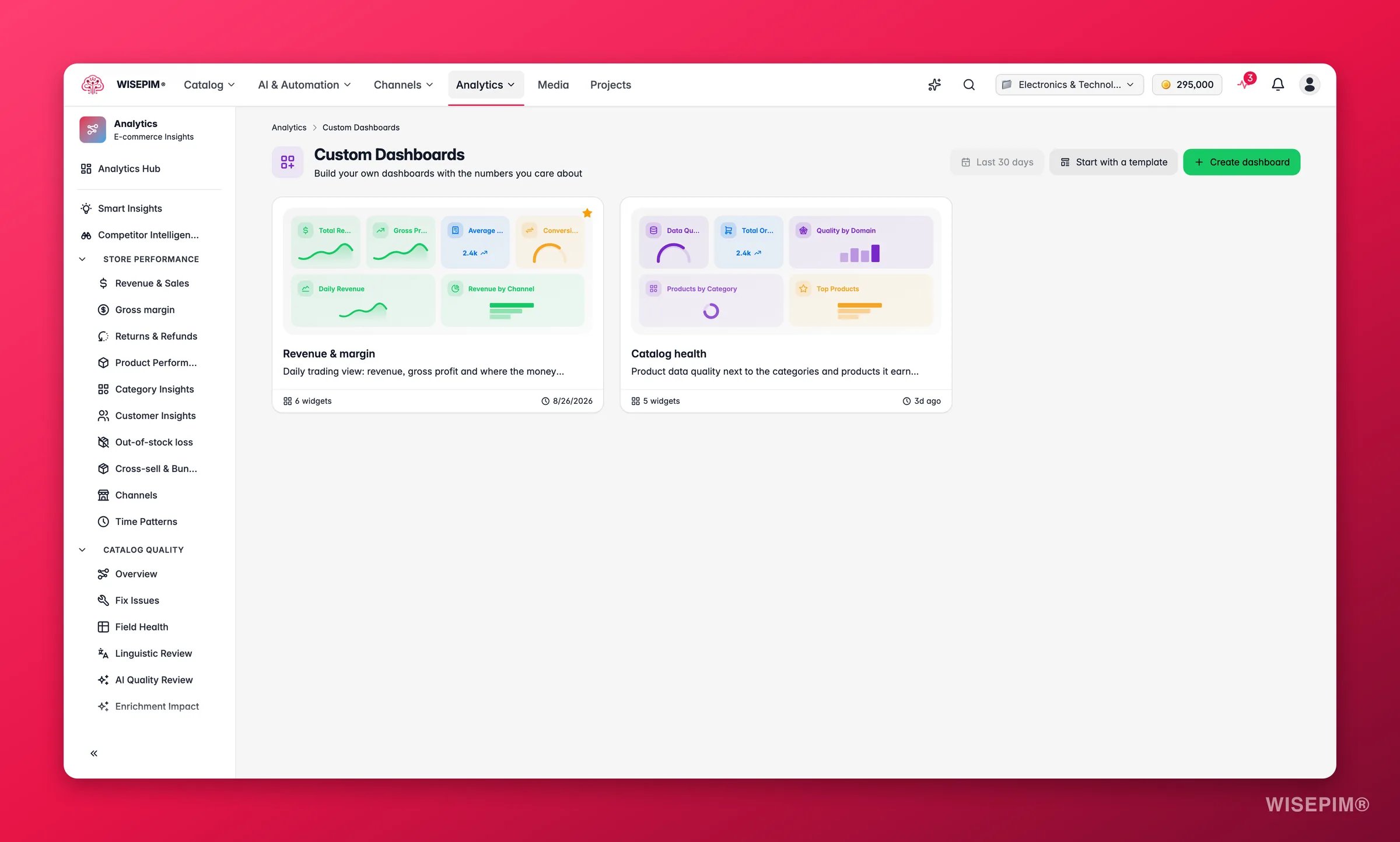
In the sidebar, go to Analytics > Custom Dashboards. You see a grid of your dashboards, or an empty page if you have none yet.
2
Start a new dashboard
Click Create Dashboard to open the builder with a blank canvas. To start from a ready-made layout instead, click Start with a Template.
3
Name it
Click the title in the page header and type a clear name, like “Daily Sales Overview” or “Product Launch Tracker.”
4
Add widgets
Drag metrics from the widget panel onto the canvas. Each widget tracks one metric or shows one visualization.
5
Save
Click Save in the top-right corner. Your dashboard is stored in the cloud, so you can reach it from any device.
Build your layout
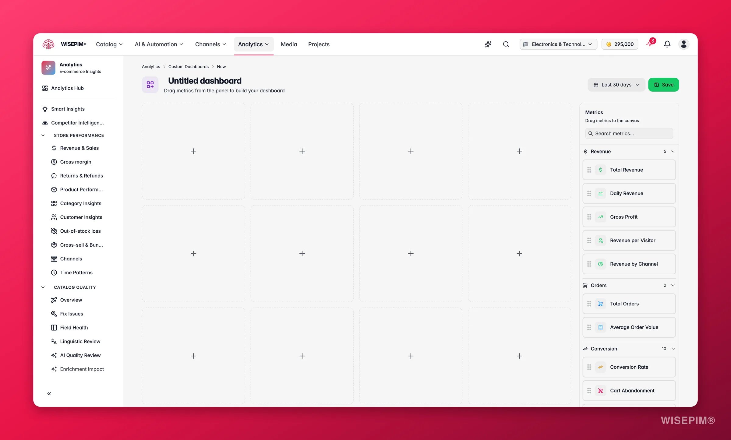
- The canvas: where your widgets live. Position and resize them to get the layout you want.
- The widget panel: a sidebar that lists every metric and visualization you can add.
Add a widget
Browse the widget panel. Each widget has a name and description so you know what it shows. Drag a widget onto the canvas to add it.The widget library
Pick the widget that matches the question you are asking. A single number answers “where are we right now?” A chart answers “how did we get here?” and “which part is the problem?”Configure a widget
Every widget binds to a live metric from your account, so the numbers on your dashboard are the same numbers behind the full reports. Pick a metric such as Daily Revenue for a trend line or Revenue by Channel for a breakdown, then set the display options. Depending on the widget type, you can:- Choose which metric to show
- Set the time range for the data
- Set comparison periods
- Filter by product family, category, or channel
Move and resize
Drag a widget to move it. Pull its edges to resize it. Make your most important metrics bigger so they stand out.Your changes are not saved automatically. Click Save before you leave the page, or you lose your layout and widget settings.
Start from a template
1
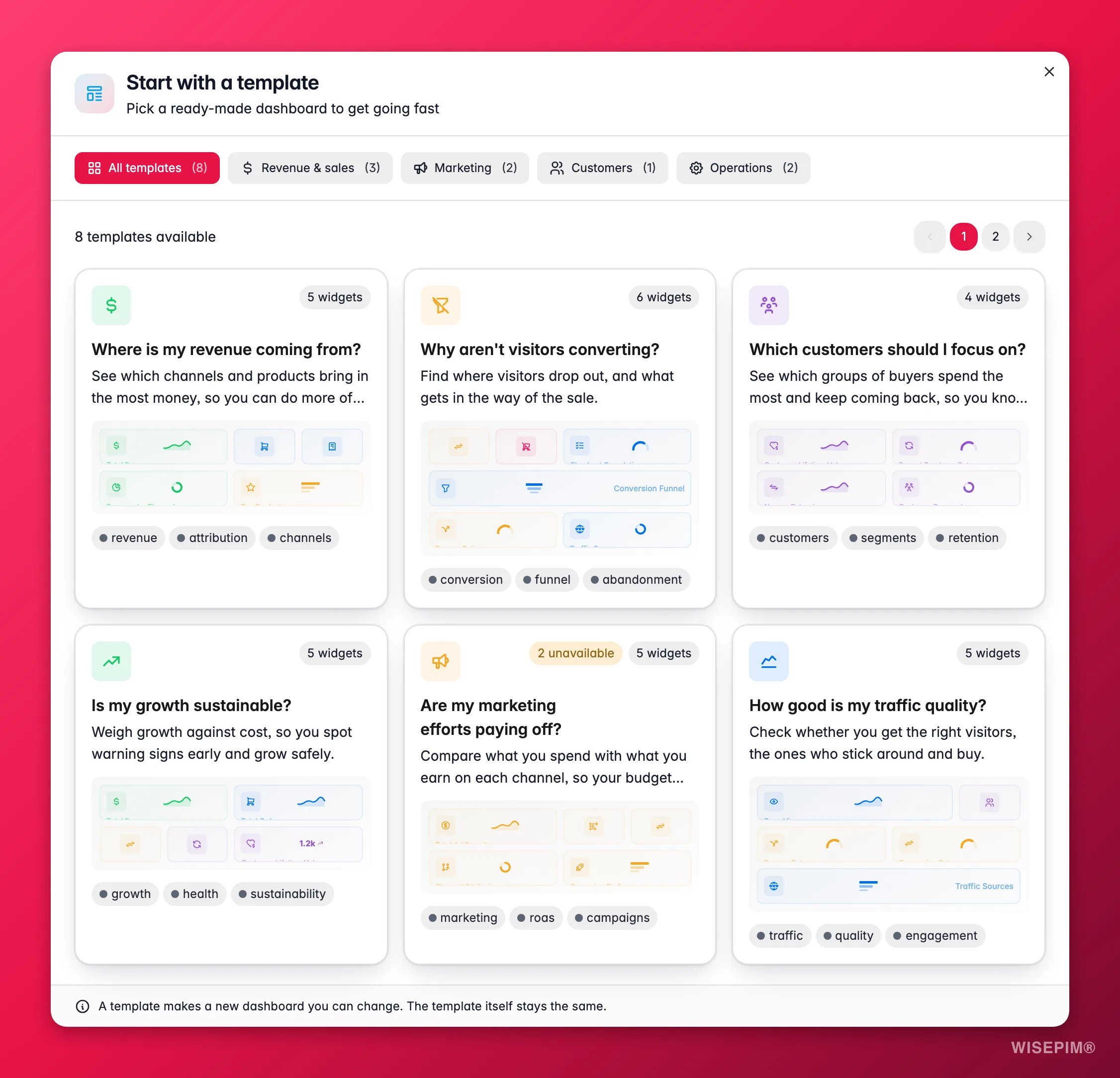
Open the Template Library
On the Custom Dashboards page, click Start with a Template.
2
Pick a template
Browse the templates. Each one shows a description and a preview of its widgets. Click one to create a dashboard from it.
3
Make it yours
A template-based dashboard works like any other. Add, remove, or rearrange its widgets to fit your needs.
Manage your dashboards
The Custom Dashboards page shows every dashboard as a card. Each card displays the name, a preview of its widgets, and quick actions to edit, duplicate, and delete. Once you have more than six dashboards, pagination appears so you can browse them all.Edit a dashboard
Edit a dashboard
Click a dashboard card to open it in the builder. Make your changes, then click Save. If you try to leave with unsaved changes, you are asked to save or discard them first.
Duplicate a dashboard
Duplicate a dashboard
Use the duplicate action on a card to make an exact copy. This saves time when you want a variation of an existing dashboard. For example, clone “Sales Overview” to create a region-specific version.
Favorite a dashboard
Favorite a dashboard
Click the star icon on a card to favorite it. Favorited dashboards appear in the analytics sidebar, so you can open them in one click from anywhere in Analytics.
Delete a dashboard
Delete a dashboard
Use the delete action on a card to remove a dashboard you no longer need. You are asked to confirm first.
What makes a good dashboard
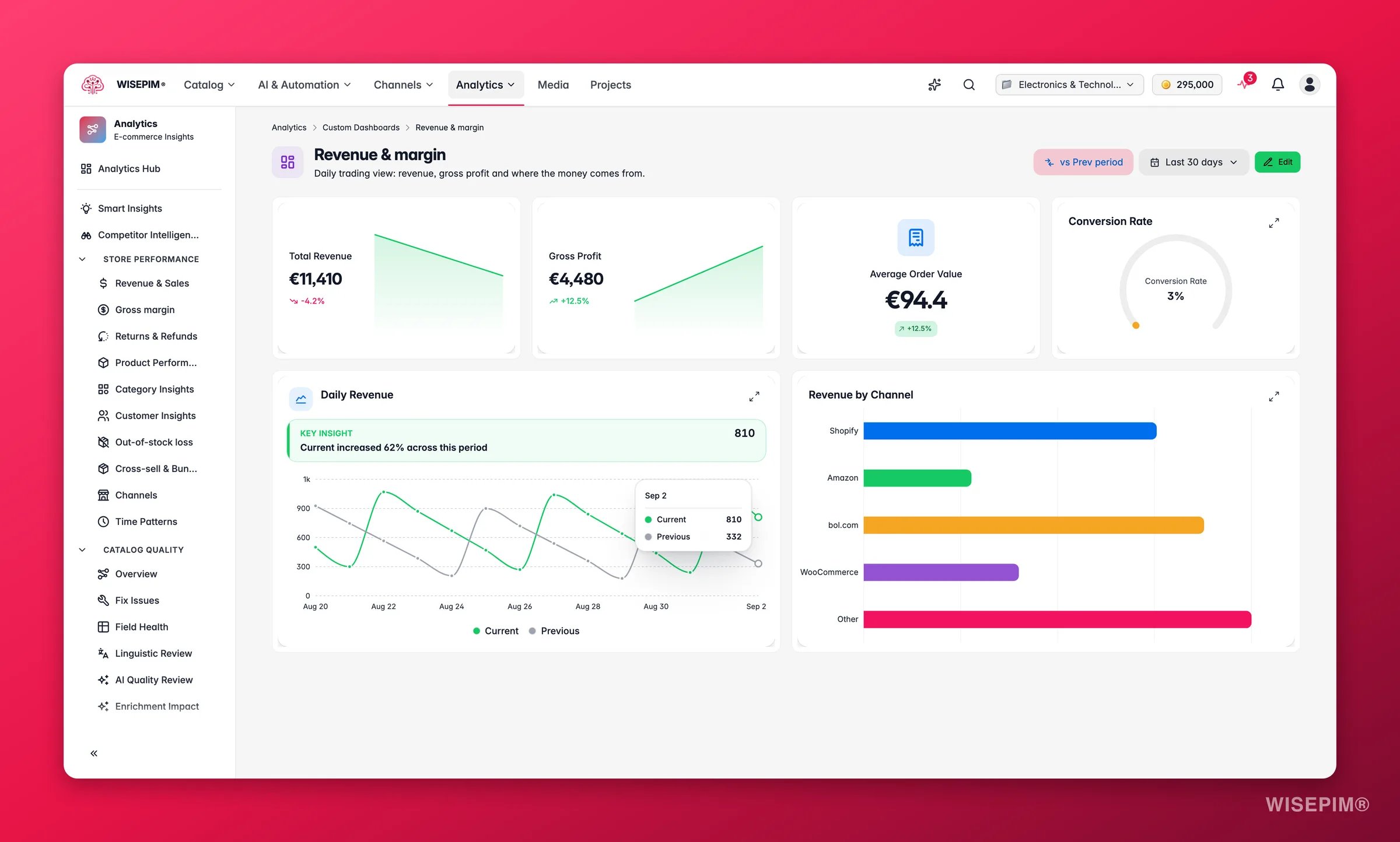
A dashboard is only useful if it tells you something new quickly. Keep these principles in mind when you build:- One job per dashboard. A daily operations dashboard should answer “is anything broken right now?” A weekly management dashboard should answer “are we on track this month?” Mixing the two creates noise.
- Lead with the most important metric. Make it the largest widget, placed top-left. If the first thing you see on the daily ops dashboard is your quality score, you will scan for anomalies faster.
- Limit to 6–10 widgets. More widgets means more time scanning, which defeats the point. If you need more, make a second dashboard.
- Include at least one trend widget. A single number without context (revenue today vs. yesterday) tells you less than a sparkline over 30 days. Pair point-in-time KPIs with trend lines.
- Set comparison periods on KPI widgets. A revenue number without a period-over-period comparison is hard to interpret. Even a “vs. previous 30 days” comparison tells you immediately whether the number is good or bad.
View a dashboard
Act on what you find
A KPI widget looks unexpectedly low or high
A KPI widget looks unexpectedly low or high
A custom dashboard surfaces the anomaly, but it does not explain it. Click through to the full analytics report behind the metric for the breakdown. For revenue drops, go to Revenue & Sales. For quality drops, go to Data Quality. Custom dashboards are the alarm; the full reports are the diagnosis.
You need a dashboard for a product launch or campaign
You need a dashboard for a product launch or campaign
Use a template as a starting point, then filter its widgets to the relevant product family or category. Set the time range on each widget to cover the campaign period. Duplicate it as a baseline before the launch so you can compare launch-day metrics against the pre-launch period. Outcome: rapid feedback on whether the launch is performing as expected while it is still running.
You want a real-time operations view
You want a real-time operations view
Add a Data freshness widget and a channel sync status widget alongside your revenue and quality metrics. If a sync stalls, you will see it on the dashboard immediately rather than discovering it hours later when numbers stop updating. Outcome: faster incident detection, reducing the window of stale data before it is noticed.
Move local dashboards to the cloud
Your dashboards are stored in the cloud, so you can reach them on any device where you are logged in. If you created dashboards before, when they were saved in your browser, WISEPIM finds them and offers a one-click migration.1
See the banner
When WISEPIM finds local dashboards, a migration banner appears at the top of the Custom Dashboards page.
2
Migrate
Click Migrate Now to move all your local dashboards to the cloud.
Once migration finishes, your dashboards are available on every device.
Related
Data Quality Analytics
Track and improve your product data quality with completeness scores and clear suggestions.
Analytics Overview
Go back to the Analytics Hub for a full view of all your e-commerce metrics.