

Revenue data comes from your connected e-commerce integrations. You need at least one platform connected, with order data synced, to see metrics here.
Key metrics
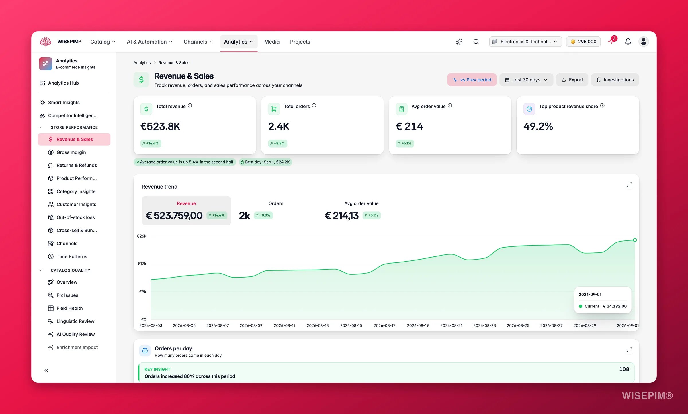
What good looks like
These ranges give you a sense of where a healthy store sits. They are directional, results vary by category, price point, and channel mix. Use them alongside your own period-over-period trend.AOV benchmarks differ widely by vertical. Fashion and home goods average €50–€80; electronics and furniture often exceed €200. Compare your AOV trend over time rather than against a single threshold.
Insights
At the top of the report, a row of insight chips surfaces patterns that are easy to miss in raw numbers. These update whenever you change the date range:- Revenue forecast: when your selected period is only partly elapsed, this chip projects end-of-period revenue based on the trajectory so far, useful for knowing whether you are on track before the month closes.
- Channel concentration warning: if a single channel accounts for 50% or more of revenue, a warning chip flags the dependency so you can decide whether to invest in secondary channels.
- Busiest weekday: the day of the week averaging more than 10% above your daily average, so you can time promotions and content refreshes to land just before your peak.
- AOV trend: whether average order value is rising, flat, or falling versus the previous period, at a glance before you scroll to the chart.
- Biggest single day: the top-revenue day in the period with its date and value, handy for confirming that a campaign or sale landed as expected.
Read the charts
Below the key metrics, five views break your sales down in different ways.Revenue trend
A line chart compares revenue across two time periods: current versus previous. Use it to spot growth, decline, and seasonal patterns. Hover over any point for the exact daily value.Orders per day
When order data is available, an Orders per day chart sits alongside the revenue trend. Reading them together is more revealing than either alone: revenue growing while daily orders are flat means AOV is rising; orders climbing while revenue is flat means smaller baskets. Use the pair to diagnose what is actually driving a change.Revenue by channel
A donut chart shows how revenue splits across your connected sales channels, such as Shopify, WooCommerce, or Magento. Use it to see which channels drive the most revenue, and whether your mix is balanced or leans on one platform.Revenue by category
A horizontal bar chart ranks your product categories by revenue. Categories at the top earn the most. Use it to confirm your strongest categories and catch underperformers that need attention.Top products table
A sortable table lists your highest-revenue products. Columns cover product name, SKU, revenue, units sold, and average selling price. Sort by any column to find your best sellers, or to spot products with unusually high or low average prices.Explore revenue
Click Explore all N on the top-products table to open the Explore revenue modal. It lists everything that earned revenue in the period, with tabs for Products, Categories and Channels. Each row shows Revenue, Orders, Units, Share of revenue and a Running total, so you can read down the list and see where the bulk of your revenue stops. A Pareto line at the top sums it up: “N of M products make up 80% of revenue in this period.” Segment chips slice the product list:
Search the list by product name or SKU, and use Export this view to download the rows you are looking at as CSV.
If the totals load but a breakdown does not, the report shows Some breakdowns are temporarily unavailable and keeps the totals and trends current. When there are no orders at all in the range, you get No revenue in this period with a Show the last 90 days shortcut.
Act on what you find
Revenue is growing but orders are flat, AOV is rising
Revenue is growing but orders are flat, AOV is rising
Confirm the source. Check the Top products table to see whether the revenue increase is coming from higher-priced items or from customers adding more to their baskets. If it is unit-driven, double down: use Bulk Edit → Change price to incrementally raise prices on your top sellers and watch whether order volume holds. Outcome: sustained AOV gains from confirmed demand elasticity rather than one-off price spikes.
One channel drives over 70% of your revenue
One channel drives over 70% of your revenue
A single-channel dependency means one bad algorithm update, policy change, or outage can crater your month. Check the Revenue by channel donut to confirm the split, then open Channels for a side-by-side comparison. Prioritise improving product content quality for under-performing channels via Enriching products, poor content quality is the most common reason a channel converts worse than expected. Outcome: a more balanced revenue mix that is resilient to single-channel volatility.
A top category is declining
A top category is declining
First, confirm whether the drop is seasonal by switching to a 12-month range and comparing the same period last year. If it is structural, open Product Performance and filter to that category to find which products are falling. Then use AI enrichment to refresh stale descriptions and images on the declining items. Outcome: recovered category revenue by addressing the content issues that suppress conversion on the way down.
AOV is dropping despite stable or rising order count
AOV is dropping despite stable or rising order count
Check for heavy discounting in the Top products table: a low average selling price on high-volume items is a common cause. Then run a Bulk Edit → Change price to test a modest increase on your highest-volume products. Consider also setting up an automation that flags products whose selling price dips below a target margin threshold. Outcome: AOV recovery without sacrificing order volume, and a safeguard against future margin erosion.
Revenue forecast is below your monthly target
Revenue forecast is below your monthly target
The forecast chip on this page shows your end-of-period pace. If you are behind target early in the month, open Time Patterns to find your busiest upcoming days, then schedule promotions or content pushes to land just before those peaks. Outcome: corrective action taken while there is still time to close the gap, rather than discovering the shortfall at month-end.
Related
Product Performance
Drill into individual product metrics to find your best and worst performers.
Channels
Compare performance across your connected sales channels side by side.
Category Insights
Analyze revenue, orders, and market share at the category level.