

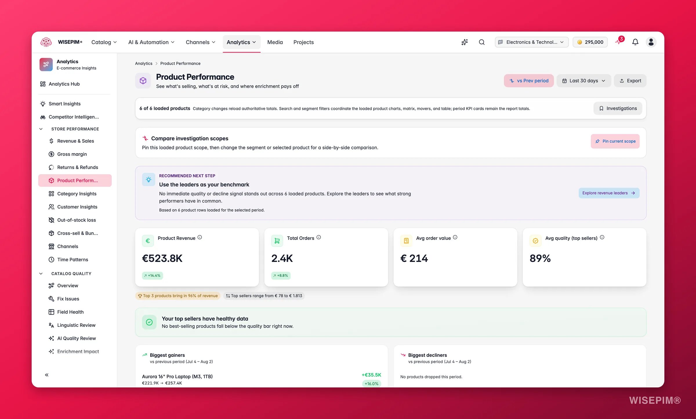
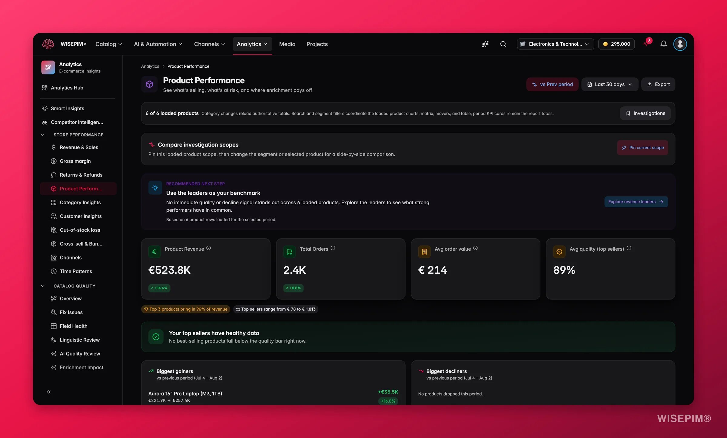
Order data powers revenue and sales metrics. A connected Google Analytics 4 property adds item views and funnel metrics, and a connected Google Search Console property adds product-attributed search clicks, impressions, and positions. Products seen in GA4 can appear with zero synced sales, so high-traffic conversion gaps are not hidden.
Metrics you get
Use the Category filter to scope the whole report to one category. Sales totals, top products, the previous-period comparison and the GA4 and Search Console facts then only count products that sit directly in that category. Subcategories are not included, so pick the leaf category you want to judge.GA4 product funnel
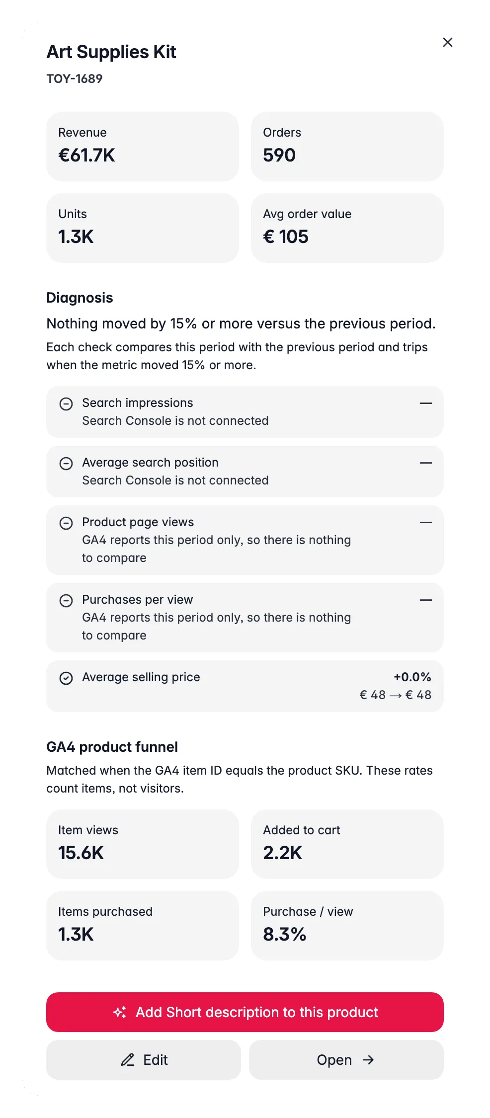
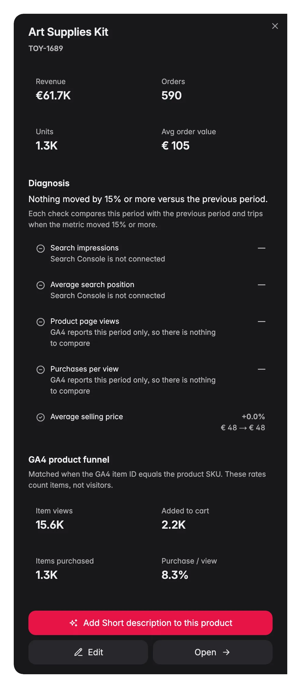
When GA4 is connected, WISEPIM combines commerce behavior with order and content-quality data. This exposes products that attract attention but fail to turn that attention into carts or purchases. The product funnel includes item views, additions to cart, checkouts, purchased items, item revenue, unit cart rate, and unit purchase rate. These are item-unit rates, not visitor-session conversion rates.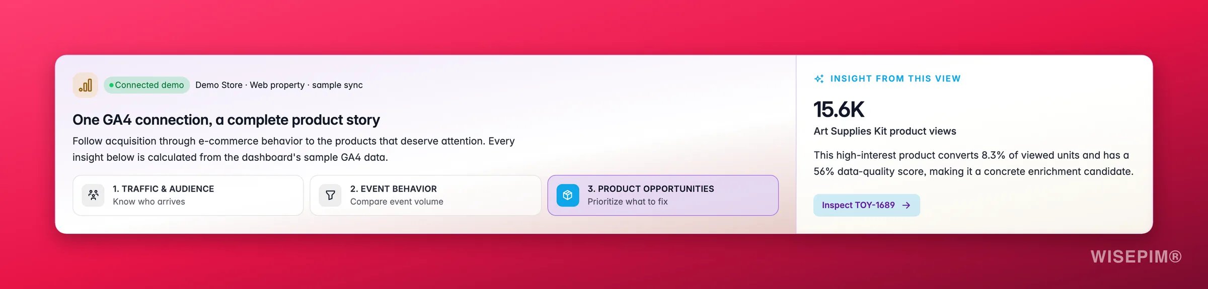
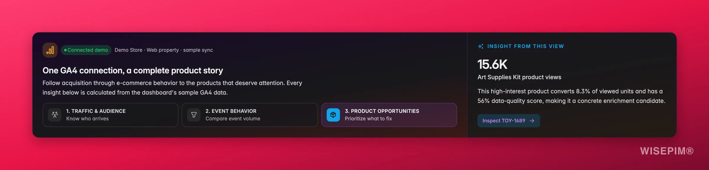
The GA4 totals in the KPI cards are computed across all matched products in the date range, not just the rows currently visible in the table. Filtering or limiting the table does not change them.
Google Search product performance
With Google Search Console connected, a Google Search product performance card appears below the KPI row. It shows the clicks, impressions, CTR, and average position attributed to your products in the selected period, along with how many products the metrics are attributed to. Two provenance details keep the card honest:- A freshness chip shows how far the data runs and its lag. Search Console data always trails by about 3 days; the card flags itself Stale when the lag grows beyond that.
- A coverage line breaks the catalog down by mapping status: matched, not in sitemap, ambiguous, and unmatched. Products are attributed by matching their URLs against your sitemaps, so a product missing from the sitemap contributes nothing. The Sitemap gaps view lists every affected product.
What good looks like
Quality scores are calculated by WISEPIM’s data-quality engine. A score of 80+ generally means a product has complete descriptions, images, and structured attributes. See Data Quality for how scores are derived and which fields carry the most weight.
Revenue at Risk
The Revenue at Risk card sits at the top of the report and quantifies how much revenue is threatened. It aggregates products where revenue is declining period-over-period and the data-quality score is below the threshold needed to sustain strong conversion. The card shows the total revenue at risk and a count of the products contributing to it, so you have a business-case number before you start fixing content.Product Movers
The Product Movers section shows the biggest positive and negative shifts in revenue compared to the previous period. Risers are products gaining momentum, worth examining to understand what is working. Fallers are products losing ground, a prompt to check for content issues, stock problems, or new competition.Priority Matrix
The Priority Matrix is a scatter plot with revenue on one axis and data-quality score on the other. It makes the highest-priority products obvious: anything in the high-revenue / low-quality quadrant is earning well today but is fragile, a quality improvement there has the clearest ROI. Products in the low-revenue / high-quality quadrant are well-described but not selling, which points to a visibility or pricing issue rather than a content one.Read the report
Best sellers
A horizontal bar chart ranking your top products by units sold. These are your volume leaders: the products customers buy most, whatever the price.Revenue by category
A donut chart showing how product revenue splits across your categories. Read it alongside the category bar chart on the Revenue & Sales page to compare volume against value.Recommended next step
Above the product table, a Recommended next step card turns the loaded rows into one action. Which card you get depends on what stands out:
The card only looks at the product rows loaded for the selected period, so it changes with the date range and the Category filter.
Top products table
The Top product performance table covers Sales, quality, GA4 views, and Search Console metrics for up to the 500 highest-ranked products. Segment chips above it filter the rows:
Each row shows the product name and SKU, Revenue, Units sold, Δ vs prev and Quality. Δ vs prev is revenue in this period measured against the comparison period, as a percentage of that baseline, with the absolute change underneath. Sort it ascending for the biggest declines; products without a baseline stay at the bottom. GA4 adds GA4 views and Purchase / view when product-level data is available, and Search Console adds GSC clicks, GSC impressions and GSC position for attributed products. Use Show to change how many rows load, search the loaded products, or sort any column to surface a different insight:
- Revenue: your highest-value products.
- Units: your highest-volume products.
- GA4 views: products attracting the most measured attention.
- Purchase / view: products that convert item views into purchased units.
- GSC impressions: products Google shows most in search results.
- GSC position: where each product ranks on average.
Analytics tables remember your sort order and page per project, so the table opens the way you left it.
Explore product performance
Click Explore all above the table to open the Explore product performance modal. It holds every product row loaded for the period, 25 per page, with a search box, a Table / Chart toggle and Export this view for a CSV of exactly what you are looking at. First pick which products to list: Revenue leaders, Volume leaders or All loaded. Then pick which metrics to show:
Segment chips narrow the list further:
Highlight tiles at the top of the modal tell you how concentrated the view is (the share of revenue the top products drive), name the biggest riser and faller, and point you to a segment when it has products in it. Show these products applies that segment. The Funnel and Search views say so when none of the loaded products have GA4 shopping events or Search Console data yet.
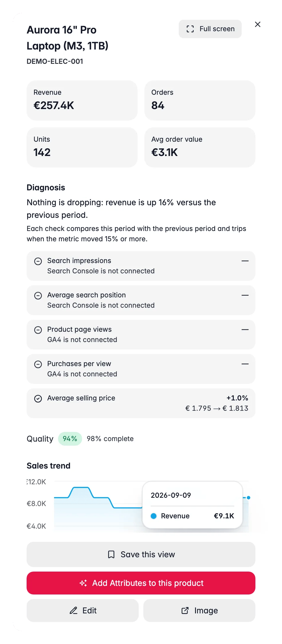
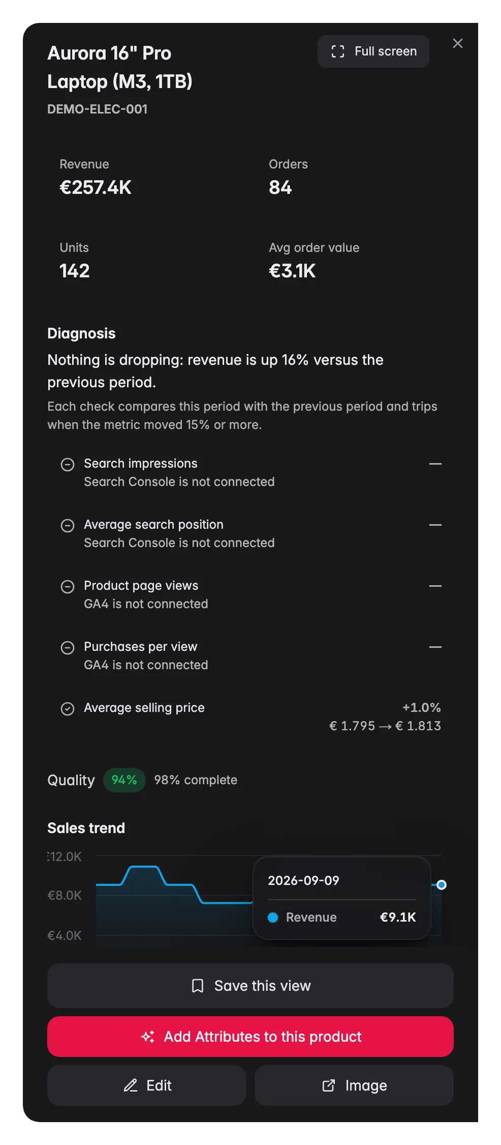
Clicking a row in the modal opens a detail panel with a one-line revenue summary versus the comparison period and four sections: From view to purchase (the GA4 product funnel, with the biggest drop-off called out), How it shows up on Google (clicks, impressions, click-through rate, average position and top search terms), Content quality (score, completion and weakest fields) and How it ranks (its rank among peers in its category or family). Open in catalog takes you to the product itself.
Orders by product
Below the period table, Orders by product is an all-time view: it counts every synced order, so the date range above does not apply. Click Load complete catalog when you need the all-time order report or its CSV. The summary then shows Products ordered, Never ordered and Avg. orders per sold product, and Review never ordered jumps to the products that have never sold. Switch between Best performing and Worst performing to rank the catalog, search within a segment, or Export all products.Act on what you find
The Priority Matrix shows products in the high-revenue / low-quality quadrant
The Priority Matrix shows products in the high-revenue / low-quality quadrant
These are your clearest wins. The demand is proven, the content is holding them back. Open the product drawer to see exactly which fields are incomplete, then use AI enrichment to fill the gaps. Work through the At risk segment in the table to prioritise by revenue at stake, or open Needs content work in the explorer. Outcome: recovering conversion on products that already have traffic, with no additional spend on acquisition.
A high-volume product has a low average selling price
A high-volume product has a low average selling price
High volume at low price can mean you have underpriced a strong product. Use Bulk Edit → Change price to test a 5–10% increase on your top-volume items. Monitor the Falling segment the following week to check whether unit sales hold. Outcome: higher revenue per unit from demand that already exists, without needing more traffic.
Most revenue comes from fewer than 10 products
Most revenue comes from fewer than 10 products
A top-heavy catalog is fragile. A single supply issue or competitor move on one of those products can hit revenue hard. Open Category Insights to find the categories where mid-tier products are not keeping up, then run AI enrichment on the products sitting just below your top earners. Outcome: a wider revenue base that is resilient to individual product volatility.
The Fallers section shows a once-strong product declining
The Fallers section shows a once-strong product declining
Click the product row to open the detail drawer. Check whether the revenue trend has been declining for multiple periods (structural) or just the latest (possible stockout or one-off). If the quality score is low, enrich the product. If the score is high, the problem is likely external, check the Channels page to see if one channel has dropped off. Outcome: early diagnosis of decline before it becomes a revenue gap you cannot recover in the period.
High-quality products are sitting in the low-revenue quadrant
High-quality products are sitting in the low-revenue quadrant
Great content but poor sales points to a visibility or pricing problem, not a content one. Check the Search & Discovery report to see whether these products appear in internal search results. Check Channels to see if they are listed on the right platforms. If the average selling price looks high relative to the category, try a limited price test with Bulk Edit → Change price. Outcome: activating dormant inventory that is already well-prepared to convert.
Related
Revenue & Sales
See the big picture of your sales performance across all products and channels.
Cross-sell & Bundles
Find which products are frequently bought together and build bundle opportunities.
Category Insights
Zoom out from individual products to category-level performance patterns.
Google Search Console
Connect GSC to add product-attributed search metrics to this report.