

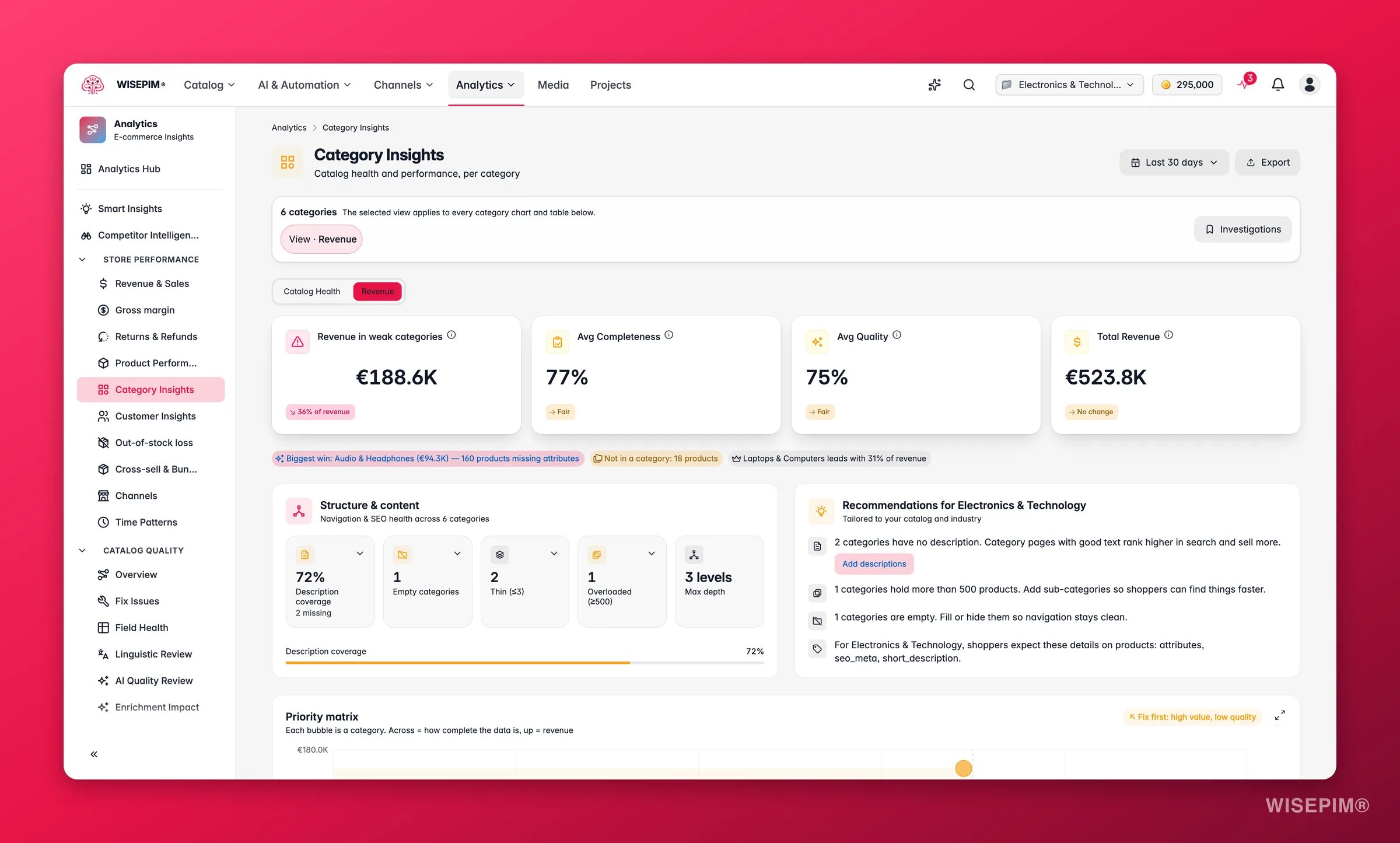
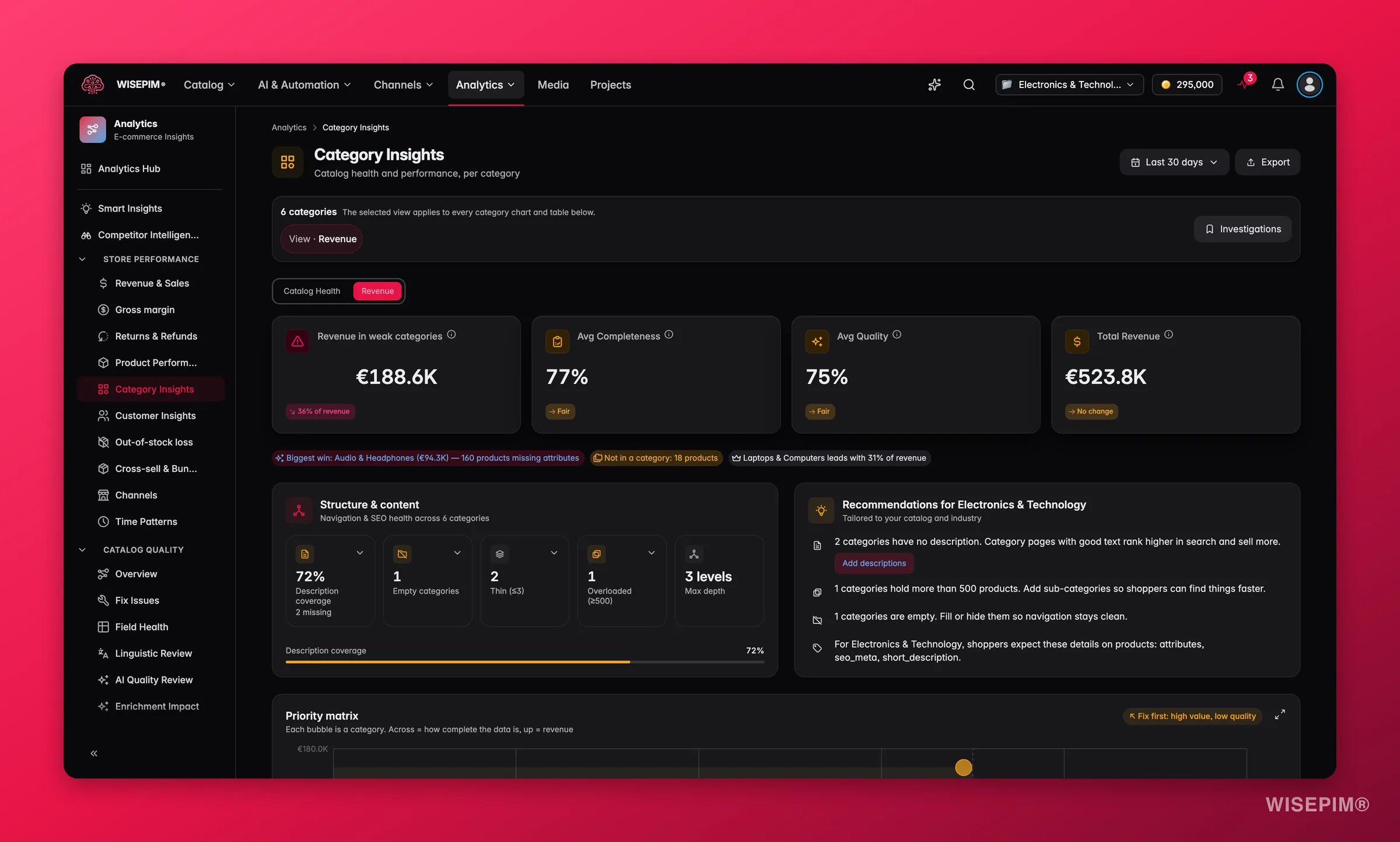
Categories come from your product data in WISEPIM. Products with no category show up under “Uncategorized”, the count of those products is shown as a CTA at the top of the report.
Metrics at a glance
The top of the report shows four numbers for the period you selected:What good looks like
These are directional thresholds, not absolutes. A high-volume commodity category can sustain lower quality scores because buyers compare on price. A premium or considered-purchase category needs higher completeness to convert.
Health vs Revenue lens
The category table can be read in two ways. Toggle between the two lenses using the switch above the table. Catalog Health lens (default) focuses on the quality of your product data:
Revenue lens focuses on commercial performance:
Switching between lenses keeps the same rows and sort order, only the columns change. This makes it easy to spot a category that earns well but has weak data, or one with excellent content but no sales traction yet.
Read the charts
Three views help you compare categories from different angles.1
Market Share donut
Shows each category’s share of total revenue. The fastest way to see how balanced your revenue is across the catalog. A very thin slice (under 2%) that has a high product count often signals a category that is poorly merchandised or positioned, products are there but buyers aren’t finding or choosing them.
2
Revenue by Category bar chart
Ranks categories by revenue, highest first. Compare it with the donut to see both absolute values and relative share. A long, flat tail of similar-sized bars is healthy. A steeply descending bar chart where the first bar dwarfs the rest signals concentration risk.
3
Category table
Lists one row per category. Sort any column to find your strongest and weakest categories. Click a row to open the detail drawer. Sorting by Period Change in the Revenue lens highlights categories that are growing or shrinking fastest, useful for spotting emerging trends or early warning signs.
Priority matrix
The priority matrix plots every category as a scatter point, with completeness on the horizontal axis and revenue on the vertical. The four quadrants each suggest a different move:- High revenue, high completeness: healthy; maintain.
- High revenue, low completeness: urgent: missing data could be costing you rankings and conversions.
- Low revenue, high completeness: good data, but the category needs marketing attention.
- Low revenue, low completeness: lowest priority unless it has strategic importance.
Category detail drawer
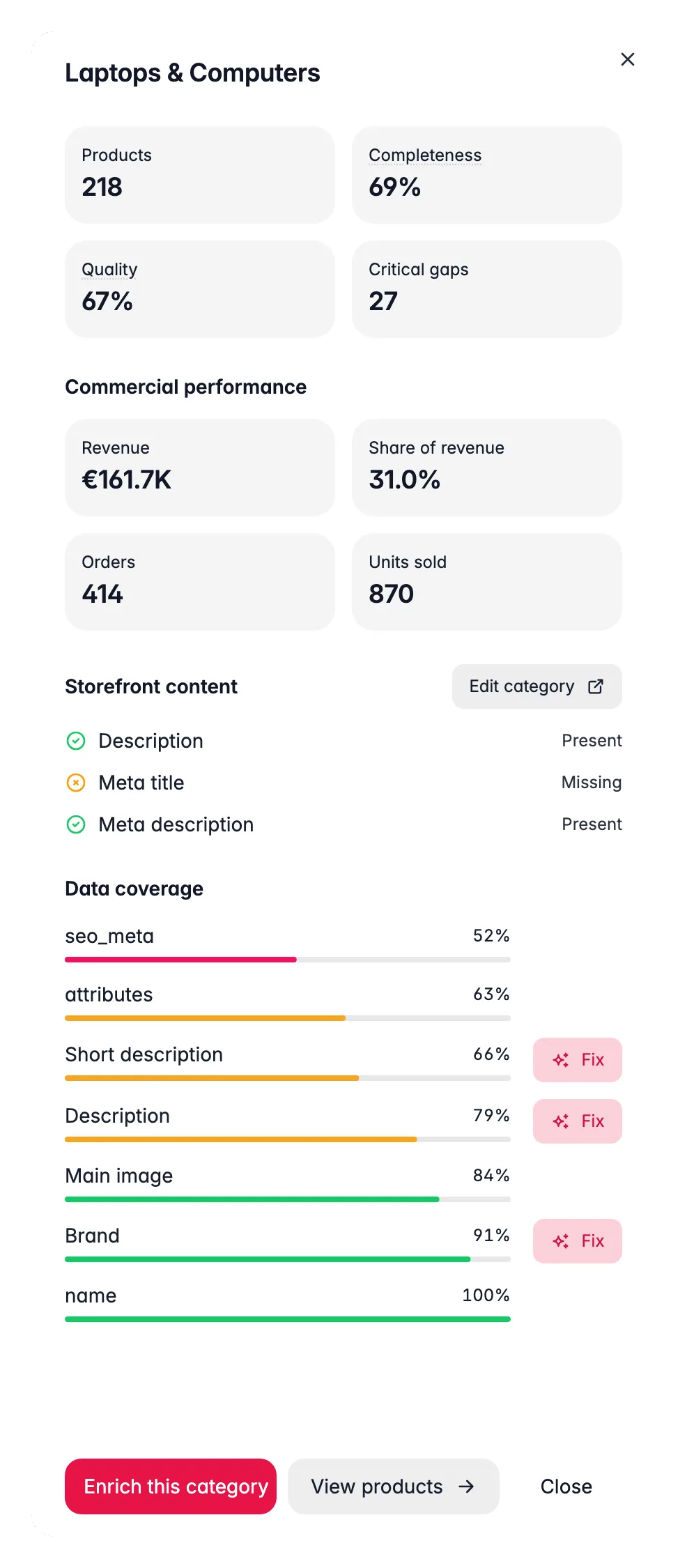
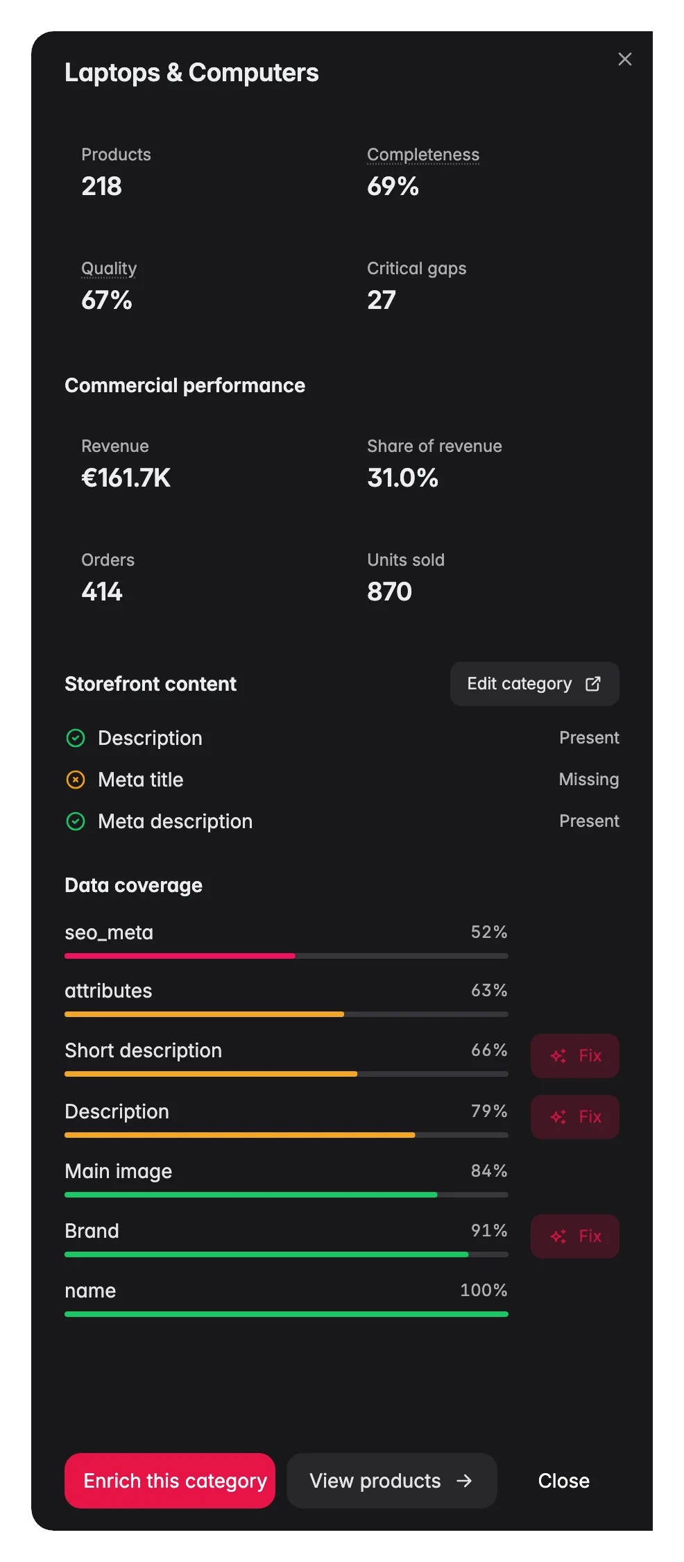
- Field coverage: a bar for each product attribute showing what percentage of products in this category have it filled.
- Meta status: whether the category’s own name, description, and SEO fields are complete.
- Industry tips: field recommendations tailored to your project’s industry (see below).
- Bulk-enrich CTA: opens the AI enrichment flow pre-filtered to this category, so you can fix gaps in one step.
Catalog structure
The Catalog Structure card at the top right summarises the shape of your taxonomy at a glance:Industry tips
WISEPIM recognises which industry your project is in (set during onboarding) and surfaces recommended fields specific to that vertical. A fashion project, for example, is reminded to fill size guides and materials; an electronics project is shown advice on technical specs and compatibility data. These tips appear both on the Catalog Structure card and inside each category’s detail drawer.Concentration insight chips
Above the main table, insight chips call out patterns that need attention:- A chip reports when the top three categories account for more than a set share of revenue (for example: “Top 3 categories = 74% of revenue”), signalling concentration risk.
- A second chip shows the count of uncategorized products and links directly to a filtered view in Products so you can assign them.
Act on what you find
Match what you see to the right move.A high-revenue category has low completeness
A high-revenue category has low completeness
This is your most urgent fix. The category already converts, every missing description, thin title, or absent image is lost revenue on top of existing sales. Click the category row to open the detail drawer, find the worst field, then use the Bulk-Enrich CTA inside the drawer to open the AI enrichment flow pre-filtered to that category. See enriching products for the full workflow. Outcome: improved descriptions and images directly lift conversion rate and organic search rankings for a category that is already generating demand.
A category has many orders but low AOV
A category has many orders but low AOV
Products sell often but at low prices. Use Product Performance to check whether your higher-priced items in the category are underperforming on views or add-to-cart rate. If so, improve their content and make sure they appear in cross-sell positions. Outcome: lifting the AOV of a high-volume category has a compounding effect on total revenue.
A category has good content but no sales traction
A category has good content but no sales traction
Strong completeness but low revenue points to a marketing or discovery gap rather than a content problem. Check SEO analytics to see whether the category’s products rank for relevant queries. If organic visibility is low, review meta titles and use automations to push products to channels where demand exists. See Automations for channel-push workflows. Outcome: distribution fixes tend to unlock latent demand faster than further content work on already-healthy categories.
One category dominates revenue
One category dominates revenue
Concentration above 60% is a risk, a seasonal dip, a supplier issue, or a platform policy change can hit total revenue hard. Use the Priority Matrix to find categories that sit in the “high completeness, low revenue” quadrant, these have the content foundation to grow with marketing investment. Outcome: even moving one secondary category from 3% to 8% of revenue meaningfully reduces dependence on the top category.
Empty categories or deep hierarchy
Empty categories or deep hierarchy
Empty categories waste crawl budget and confuse shoppers. Go to Products filtered to the relevant category to confirm it has no products, then archive or merge it. If nesting goes beyond three or four levels, flatten the structure, deep trees push product pages further from your homepage in the crawl graph, which hurts SEO. Outcome: a cleaner taxonomy improves both site navigation and search engine indexability.
Many products are uncategorized
Many products are uncategorized
Uncategorised products are invisible in category-level analytics and harder for shoppers to find via navigation. The chip at the top of the report shows the count and links directly to a filtered Products view. Assign categories in bulk using the products list, or set up an Automation to categorise incoming products on import. Outcome: categorising products makes them visible in this report and improves their discoverability through category browsing.
Related
Product Performance
Drill down from categories to individual products.
Revenue & Sales
See the full revenue picture across categories and channels.
Channels
Compare category performance across your sales channels.
Data Quality
Fix the field-level gaps the category detail drawer flags.