This report needs order history with return or refund data from your connected platforms. Some platforms only expose order-level refunds; with item-level data you also get return reasons and per-product detail.
Key metrics
| Metric | What it tells you |
|---|---|
| Return rate | Share of orders that were returned in the period. The headline number to minimize. |
| Returned orders | Number of orders with a return or refund. |
| Refunded revenue | Total money refunded, the direct margin impact. |
| Average refund | The typical refund amount. High averages point to expensive items being returned. |
What good looks like
Return rates vary widely by category and business model. These are directional benchmarks:| Return rate | Signal |
|---|---|
| Under 5 % | Strong, typical for consumables, accessories, or well-described products |
| 5 – 15 % | Normal range for general e-commerce |
| 15 – 25 % | Elevated, investigate top reasons and quality of product content |
| 25 %+ | High, common in fashion/apparel, but in other categories this signals a content or product fit problem worth fixing |
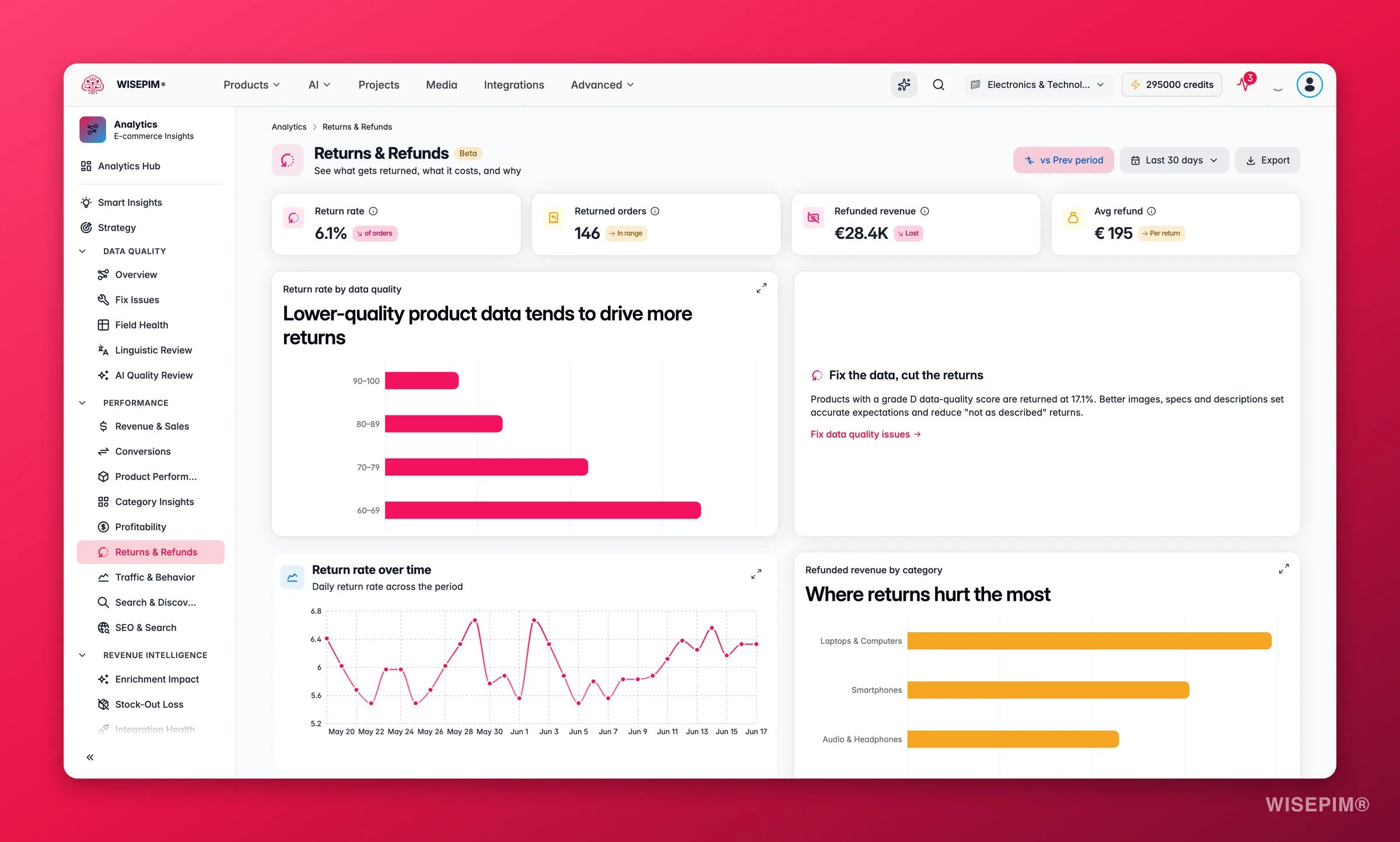
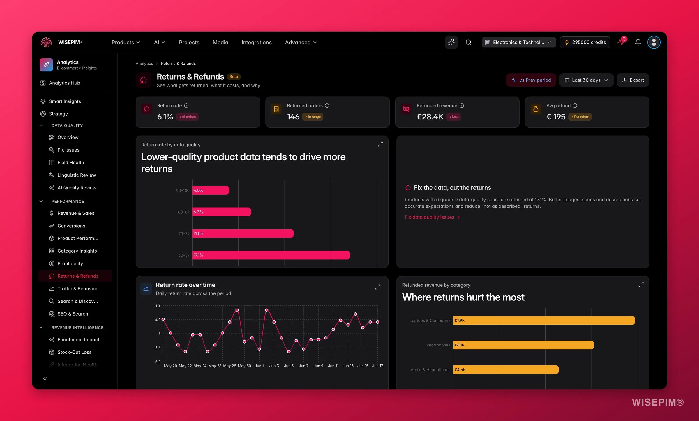
Fix the data, cut the returns
The standout chart is return rate by data quality band. Products with poor or missing content, wrong images, vague descriptions, or missing specs, are returned far more often, because customers receive something other than what they expected. The bands run from A (score 90+) down to F (below 60). Typical patterns:- Grade A and B products return at low rates because their content sets accurate expectations.
- Grade D and F products often return at 2–3x the rate of grade A products.
- The insight card surfaces your worst band and its return rate so you know exactly where to start.
Charts and tables
- Return rate by data quality: the WISEPIM differentiator. Bars ranked by return rate per quality grade (A through F). A steep gradient from left to right is the signal to enrich low-scoring products.
- Return rate over time: spot spikes and tie them to a launch, a supplier change, or a content issue.
- Refunded revenue by category: which categories cost you the most in refunds.
- Top return reasons: when item-level data is available, the reasons customers give, ranked by frequency. “Not as described” is the most actionable reason, it maps directly to content quality.
- Most returned products: a table of the worst offenders with their quality score, units sold, return count, refunded amount, and a direct link to review the product. The table subtitle notes: start with the high-quality-score ones, because those signal a product or fit problem rather than a content problem.
Reading the results
- Steep quality-band gradient (grade F returning at 3× grade A), content is the primary driver. Improving descriptions, images, and specs will move the needle faster than other interventions.
- Flat quality-band gradient (all grades returning at similar rates), the issue is product fit, sizing, or customer expectation rather than missing information. Address at the product or pricing level.
- A spike in the trend chart: correlate with recent product launches, bulk imports, or supplier changes. A new batch of products with thin content often causes a visible spike.
- High refunded revenue concentrated in one category: that category may have a structural content gap (e.g., sizing guides missing for apparel, compatibility specs missing for electronics).
Act on what you find
Grade D/F products have a high return rate
Grade D/F products have a high return rate
These are your highest-leverage targets. Open the Data Quality fix workspace at Fix Issues to see exactly which fields are missing, then use Enriching Products to fill descriptions, specs, and images with AI. Prioritize high-volume SKUs first. Outcome: lower return rate on those products within a few weeks of enrichment, with measurable impact visible in this report’s trend chart.
Top return reason is 'Not as described'
Top return reason is 'Not as described'
This is a direct content signal. Use Enriching Products to rewrite vague descriptions and add missing technical specifications. Check images in the Media Library, inaccurate or misleading images are a leading cause of “not as described” returns. Outcome: reduce the most addressable return reason and improve customer trust.
A specific category drives outsized refunded revenue
A specific category drives outsized refunded revenue
Filter the product table to that category and review the quality scores. If scores are low, run a bulk enrichment pass. If scores are high, the issue may be product fit, consider adding size guides, compatibility information, or more realistic lifestyle images. Outcome: reduce refunded revenue in the highest-cost category.
A spike appears in the trend chart
A spike appears in the trend chart
Identify the date range and correlate with any product imports, catalog updates, or supplier changes around that time. Products imported without thorough content often trigger a return spike. Use Bulk Editing or enrichment to bring new imports up to quality standards before they accumulate returns. Outcome: catch content gaps before they compound into a sustained high return rate.
Related
Data Quality
Improve the content that drives returns down.
Profitability
Returns hit margin directly. See the full picture.
Enriching Products
Fix vague descriptions and missing specs with AI.
Media Library
Accurate images are the top defense against returns.